• Design Portfolio
  • Artwork
  • About + Contact
Menu

Stephen Rice

  • Design Portfolio
  • Artwork
  • About + Contact

What happens during Puberty? Animation

Working once again with Seattle Public Schools' Social Emotional Learning department, my colleague and I developed another animation; this time an introduction video for parents and students about the changes that kids can expect when they reach puberty.

Unlike the more comprehensive Puberty and You video, this animation was made to be shown in the classroom and at family workshop events as a conversation starter regarding the physical and emotional changes puberty can bring.

Using the character library we had already developed for previous animations, we built this animation entirely within Adobe Illustrator and After Effects using the Duik Angela extension. More complex scenes were required due to the content so many additional sets, assets, and graphics were developed to best illustrate the message.

Seattle Public Schools - 2024

Social Emotional Learning Animations

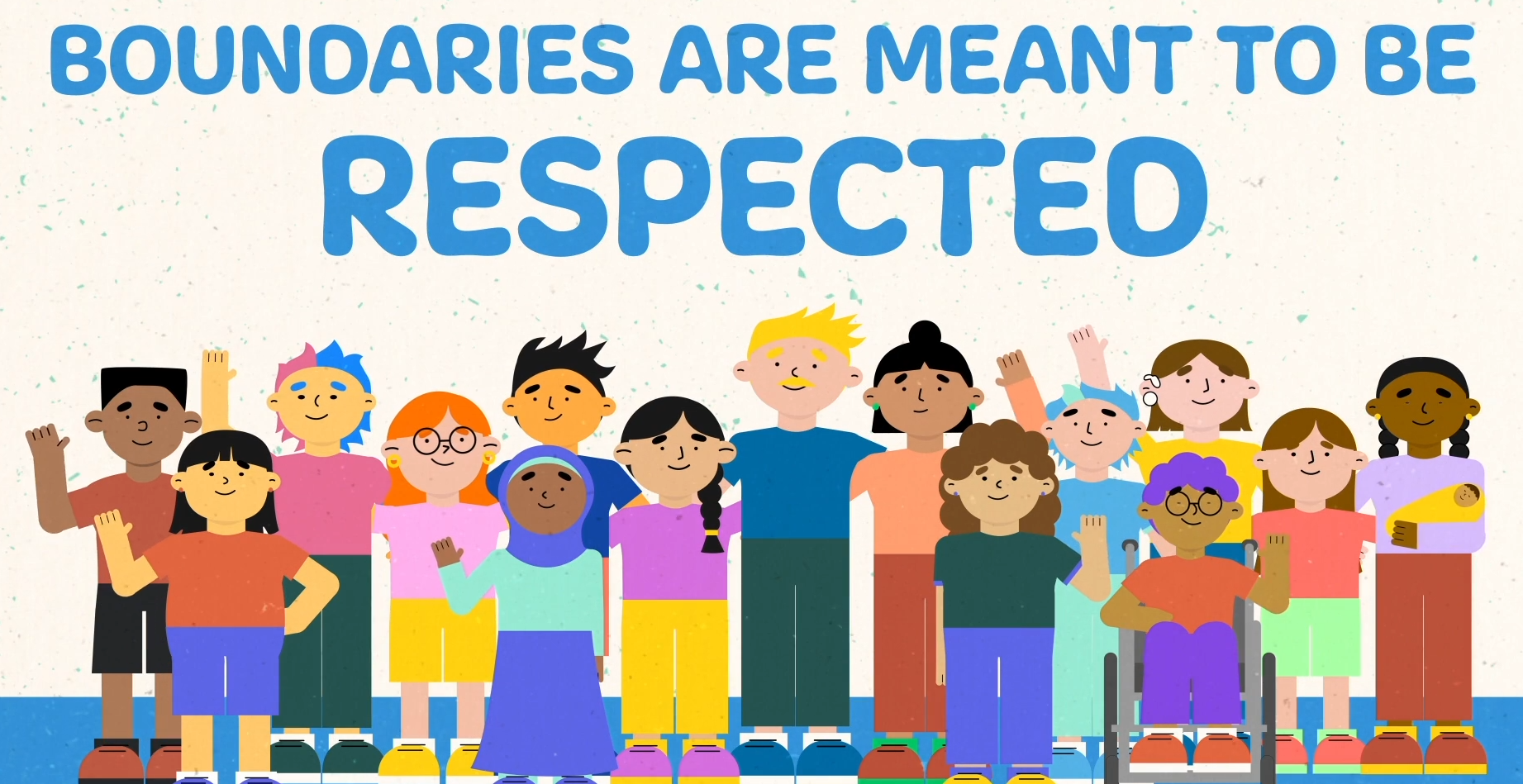
In collaboration with the Social Emotional Learning team at Seattle public schools and the Harborview Abuse and Trauma Center, my colleague and I developed a pair of animated videos to be shared in classrooms with the intent to teach grade school students about personal boundaries and handling rejection from your peers.

The creative process began with the development of a set of characters that represent the diverse spectrum of community members and students within the city of Seattle and our public schools system. Inclusion and representation remained at the forefront of both the video’s script and the accompanying animations. We chose to use the voices of elementary school students to help make the content feel more relatable and approachable; Less like a lecture and more like a conversation with a friend.

Characters and scenes were designed and animated using Adobe Illustrator, After Effects, and the Duik Angela extension. Through this process, we developed a library of rigged character models that could be used for future animations, posters, flyers and other communication and creative materials.

Seattle Public Schools - Student Health and Social Emotional Learning - 2022

NATOA 2022 - Category 8: Children/Young Adults - Award of Excellence

NATOA 2022 - Category 64: Visual Effects - Award of Distinction

Puberty & You Video

In 2020, my team and I worked with the Social Emotional Learning department at Seattle Public Schools to develop a new sexual education and puberty video for elementary and middle school students. This updated video incorporated more inclusive language, a complete and comprehensive set of topics, and a fresh visual style that is approachable and relatable for the student audience.

My colleagues and I developed the visual style, filmed the content expert, created all visual graphics and animations, and did the final edits and production on the finished piece.

To date, this puberty training has been adopted as an optional statewide sexual education course through OSPI, and is even used by other districts throughout the country.

Seattle Public Schools -Student Health and Social Emotional Learning- 2020

NATOA 2021 - Category 25: Public Health (Non-COVID) -Award of Distinction

SPS CTE Annual Report

In early 2024, I partnered with the SPS Career and Technical Education team to lay out their 2024 annual report document. The team tasked me with creating a document that could effectively communicate all of the required details, but also be visually engaging and easily understood by the general public and stakeholders. Past documents, I was told, had come across as too dry and tedious for most of the public to bother with and lacking structure for easy reading and that remedying these issues would be a priority in the design.

I began by creating a grid that I believe worked well with the combination of photos, long-form text, charts, and icon sets (which I also developed) while making sure to create enough white space so pages felt full but never cluttered.

Use of photos helped ground the document in the work that the Career and Technical Education regularly engages in and I committed early on to only using photos from actual SPS CTE events or programs instead of from stock photo libraries.

Seattle Public Schools - Career and Technical Education - 2024

cover
cover
table of contents
table of contents
Section divider page
section 1 sample page
section 2 sample page
section 3 sample page
appendix sample page

Seattle Public Schools Style Guide

In late 2019, Seattle Public Schools' public affairs tasked my team with developing a comprehensive style guide for the greater organization. Until this point, the SPS style guide was a single page document with little direction or intent behind its color, typographic and visual choices.

My colleagues and I began by modernizing the SPS logo; making the logomark more visually consistent and laying it out in a horizontal fashion with a more appropriate typeface.

From there we developed a color palette inspired by the PNW landscape and cityscape. The complete color palette reflected the beauty of the city of Seattle while also feeling appropriate for a school district by feeling hopeful, approachable, and professional. Typeface choices reflected this same approach of childlike fun mixed with a confident professionalism.

From here, we added guidelines for logo, color, and typeface usage with the goal of unifying the district with a cohesive brand and visual style that could be easy for non designers to understand and adapt to. All district computers were given brand colors and typefaces to make this transition as seamless as possible.

Seattle Public Schools - 2020

Style_Guide_5_24_2021_TESTPRINT15.jpg
Style_Guide_5_24_2021_TESTPRINT19.jpg
Style_Guide_5_24_2021_TESTPRINT18.jpg
Style_Guide_5_24_2021_TESTPRINT115.jpg
Style_Guide_5_24_2021_TESTPRINT116.jpg
Style_Guide_5_24_2021_TESTPRINT119.jpg
Previous Style Guide

SPS Department Logos

Seattle Public Schools is a large organization with many departments, teams, partnerships and programs. During my time as a visual design specialist, I have partnered with these stakeholders in the development of logos to best represent their interests.

Logo development has always been projects centered around partnership, communication and understanding. Oftentimes, my process began with simply interviewing team leadership about their group's values and goals before any design work began. This ensured alignment of priorities early on and limited unnecessary back and forths in attempts to discern what the team was ultimately looking for in a logo.

Once the design process began, it remained important to provide as many options and receive as much feedback as possible during early iterations to make sure that the final logo would be something both effective and satisfying to the teams.

Seattle Public Schools - 2019 to 2024

Final_Logo_Stephen-10.png
AAMA_LOGO_COLOR_TEXT.png
ARE_LOGO_COLOR_RGB.png
SEL_LOGO_FINALS_COLOR.png

SPSTV Poster

In 2019, the media operations center at Seattle Public Schools went through a rebrand to become Seattle Public Schools TV (SPSTV for short). Led by our newly hired manager, SPSTV sought to dramatically increase the volume and scope of the services we provided and we developed this poster to help market ourselves throughout the office.

The design lead Kristina and I came up with this poster design incorporating staged photography of our wide variety of tools, along with bright-eye catching typography. We wanted the poster to not only show our creative side, but the professional finesse we could offer to the many other teams at Seattle Public Schools.

Over the next 5 years, SPSTV went from an unknown team to one of the most recognized in the building.

Seattle Public Schools - SPSTV - 2019

 Final poster design

Final poster design

 photo staging in our studio

photo staging in our studio

 an early arrangement of the photo materials

an early arrangement of the photo materials

 Laying out the tools to be photographed

Laying out the tools to be photographed

Whole Foods Brew Guide

A redesign of a guide on how to brew different kinds of coffee and tea for the benefit of customers.

I wanted to create a clean and colorful guide that would feel inviting for customers while remaining coherent and easy to read.

Whole Foods Market - 2017

Scatter 1.jpeg
Scatter 2.jpeg
Brew Guide-02.jpg
Brew Guide-01.jpg
BRew Guide.jpg
 Colour Palette

Colour Palette

Video Story Telling

The first video focuses on the dramatic change of appearance a haircut can have on someone. I time-lapsed stop-motion photography to speed up the process and have the man's hair disappear in under a minute.

The second video was made to illustrate the a day in the life of my younger brother Jonathan during his army deployment in Afghanistan. I chose to film myself performing my own morning routine in order to create a deeper contrast in just how rugged and alien of a life he was living in the Middle East.

School Project - University of Washington School of Design - 2013

Time for a Change video
A Day in the Life of SPC Jon Rice
prev / next
Back to Design Portfolio
puberty.PNG
1
What happens during Puberty? Animation
Boundaries.PNG
2
Social Emotional Learning Animations
Puberty4.PNG
1
Puberty & You Video
Construction - Group Students on Roof.jpg
7
SPS CTE Annual Report
StyleGuide3.png
7
Seattle Public Schools Style Guide
ARE_LOGO_COLOR_RGB.png
4
SPS Department Logos
 Final poster design
4
SPSTV Poster
7
Whole Foods Brew Guide
Screen Shot 2014-04-24 at 12.04.38 PM.png
2
Video Story Telling